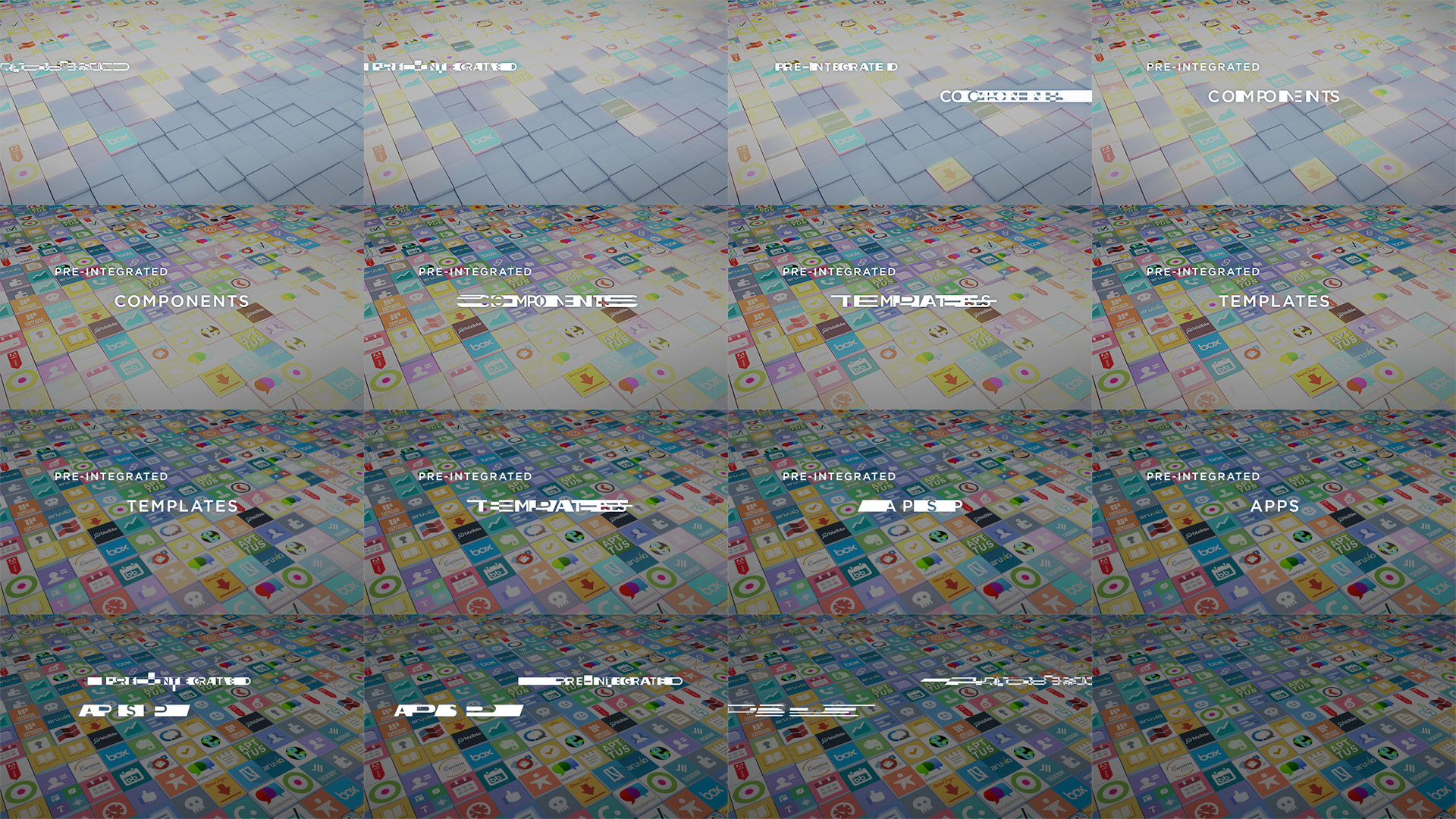
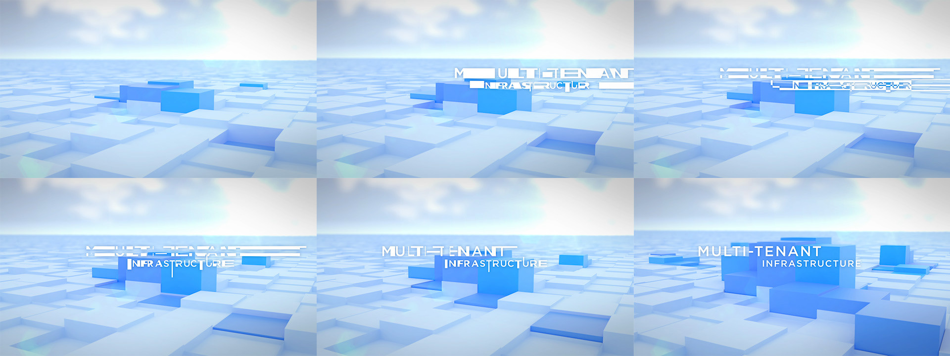
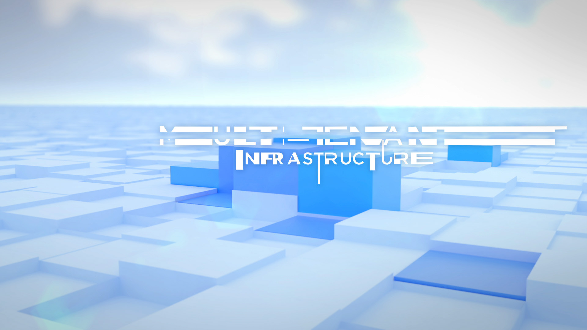
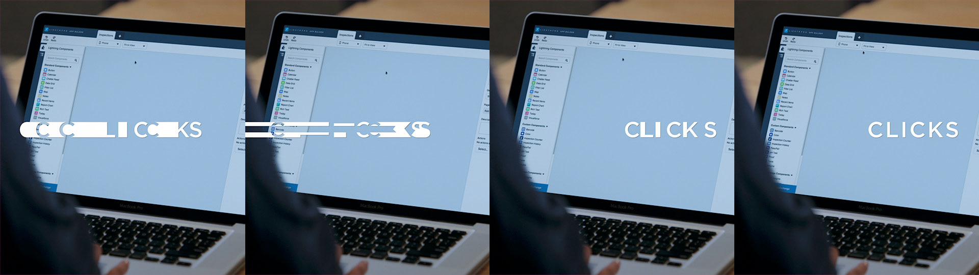
The typography treatment was originally proposed for the opening titles only, but was such a hit that it was used throughout.

DESIGN CONCEPT AND DEVELOPMENT
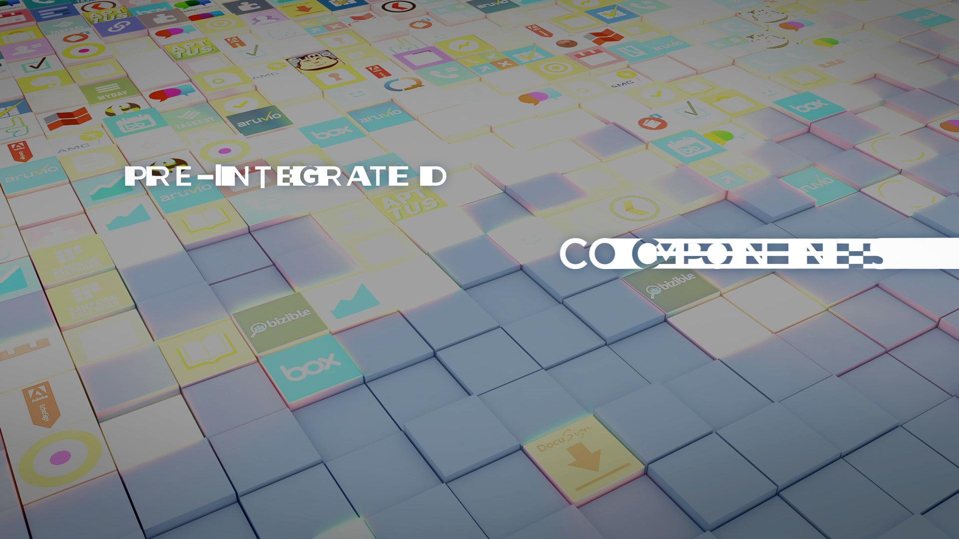
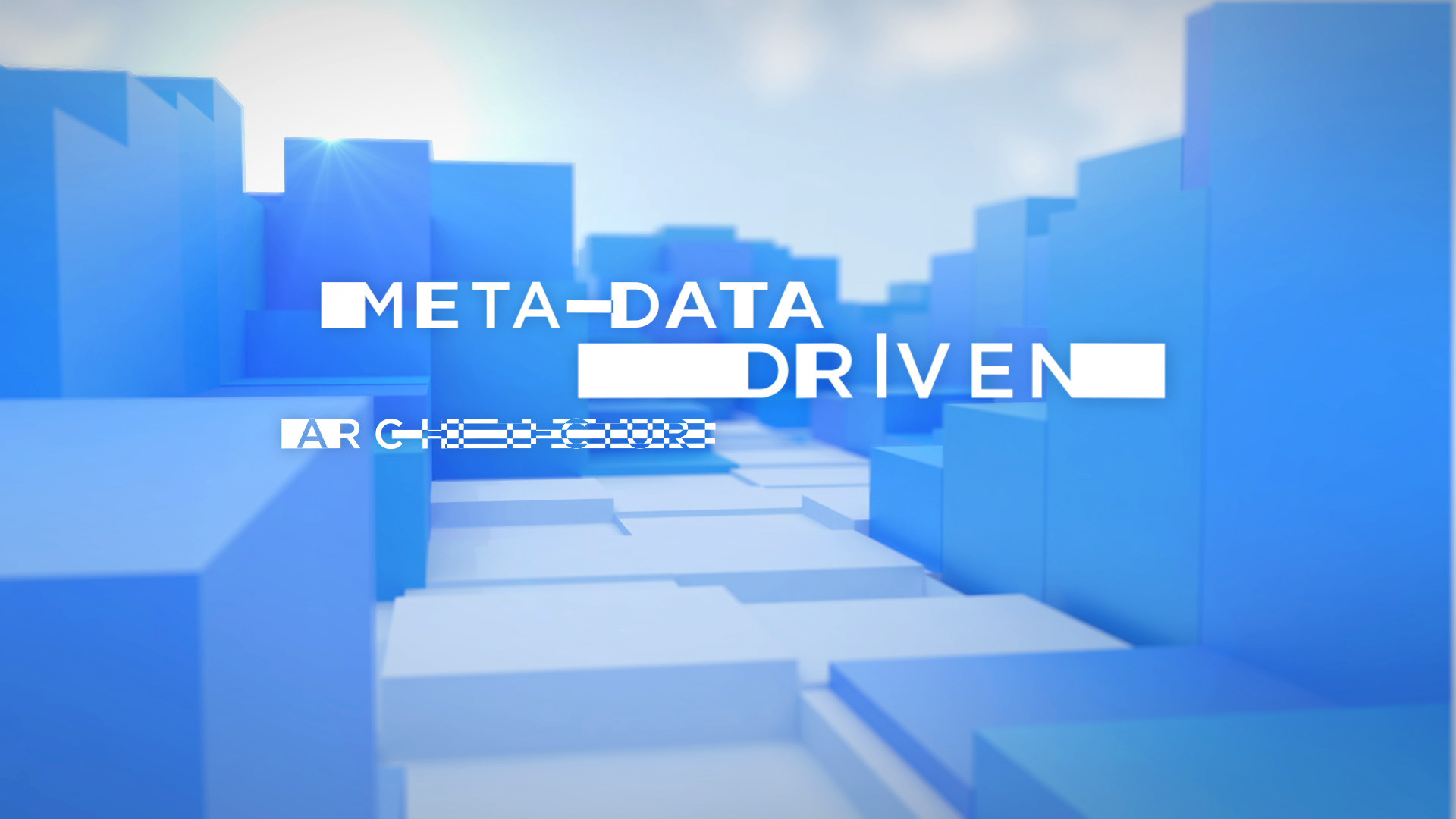
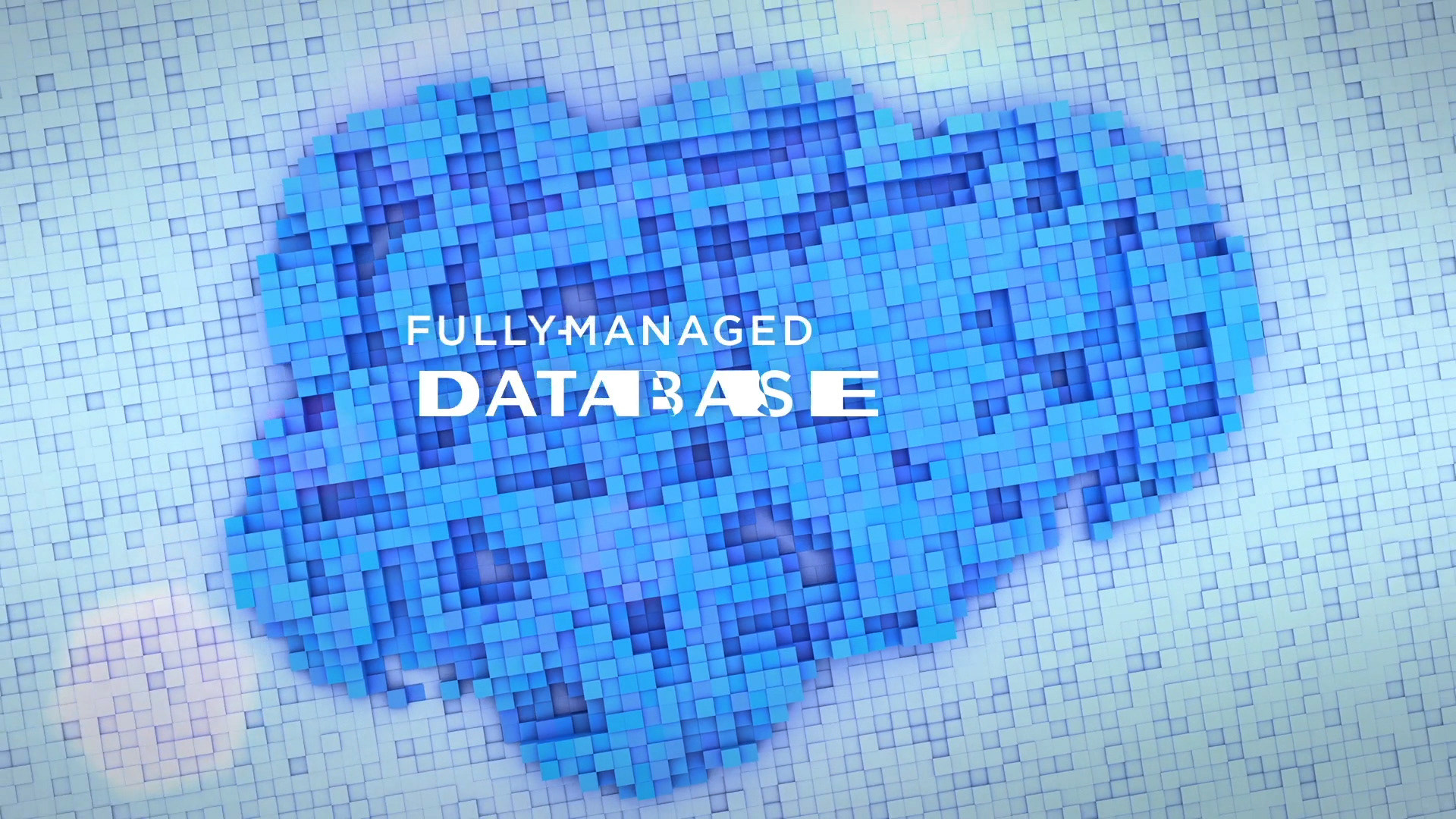
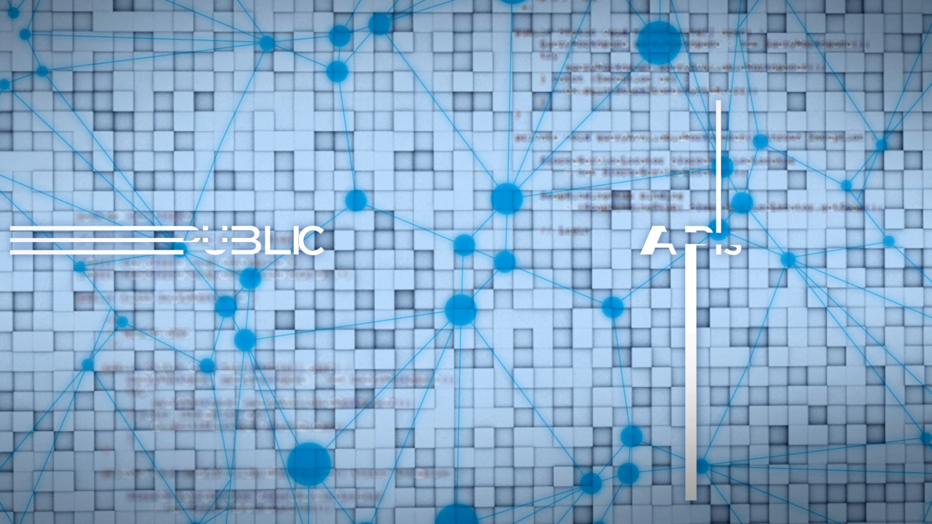
The typographic design was created to enhance the piece and further the brand’s impact. The animation needed to impart movement, infrastructure, and organized growth.
TYPOGRAPHIC TREATMENT
The typographic treatment and title animation for this project is right in line with the dynamism of the app. The typography itself takes the viewer on a trip of idea placement, disintegration, integration, collaboration and innovation.